How To Build A Top Performing Hotel Website
On a cold winter day in January of 2021, a group of elite developers, designers and digital marketers gathered in an encrypted and secret online meeting to evaluate two versions of websites for the Rancho Valencia Resort & Spa. This super confidential and ultra-top-secret meeting was recorded and the contents have been acquired by GCommerce Solutions. Here, we will lay out the trade secrets discussed by this exclusive team so that you too can build a top performing hotel website.
Before we get into the details from the meeting, it is important to have some background on the websites. Rancho Valencia Resort & Spa is located in Rancho Santa Fe, California and is one of the most awarded luxury resorts in the world. In 2019, the Resort needed to change websites and GCommerce quickly built and launched a site within a matter of weeks. This was a temporary measure until a more sophisticated website could be built for the property. At the start of 2020, a new website was launched and that is the one that is currently online in February of 2021. In reference to this article, the old, 2019 version of the website can still be viewed in the Web Archive.
In 2019, we had one version of the website and in 2020 we had another. This easily allowed us to compare performance between the different sites. Unfortunately, the Covid-19 pandemic certainly had an impact on demand and stay at the property. However, general performance on the website around Bounce and Exit rates, Avg. Time on Page and Conversion Rates can give us an idea on if a website is better suited to meet the goals of a property and which individual pages are helping to support those goals. Overall, Rancho Valencia's website had a:
- 22% decrease in bounce rate
- 7% increase in conversion rate
Less people are leaving the site and more people are booking. If 2020 had the same number of visitors to the website as 2019, a 7% increase in conversion rate would have equaled an additional $250,000 in revenue to the property.
We have two different versions of a website, but what is it about the second version of the site that works well? What lessons can we take as we set out to launch the final version of Rancho Valencia’s website later in 2021? What can this teach us about all of our website builds?
We have a short checklist below of things to keep in mind and a transcription of the recording acquired by GCommerce.
Design
- Utilize large, captivating images.
- Photography and videography should be chosen wisely to convey desired lifestyle.
- Visual breaks and design to help the user move through the content.
- Be strategic with “white” or “dead” space on the site.
- Text hierarchy – what content helps the user move through the page?
Development
- Flexibility within the content, images, text areas, calls to actions, etc.
- Being too rigid can hinder the functionality of the site.
- Provide a consistent experience to the user across different pages.
- Focus the build on working in unison: supporting content, brand, lifestyle, design, etc.
- Optimize asset usage for tracking (Google Analytics, Facebook pixels, etc.)
Search
- Research keywords with high volume that match qualifications for your property.
- Unique and keyword rich content on the website.
- Descriptive text to match the brand and amenities offered.
- Utilize keyword rich Headings.
- Separate pages based on amenities – different pages for Spa, Wedding, Meeting, etc.
- Optimize for best practice with Search Engines
Search Marketers [SM]: Right off the bat, the thing that really stands out is the difference in content. The new site has several sections of text, keyword rich headings and areas to let a user and a search engine know what the page is about and all of the services offered. This is a really unique property with a wide range of amenities, being able to host enough content to give each area of service the descriptions that they need is a major difference between the two sites.
Development Team [DV]: The biggest challenge with the new website was getting them up and running quickly onto something that showed better to their guests. The architecture that we used here was similar to one we’ve used on other sites; it’s highly customizable, which helps make easy updates to content, packages, images, text, etc. The 2019 version of the site was very inflexible; making any changes or updates required a developer and even then, it was very “locked-down” and there just wasn’t much we could do to add more to the user experience in terms of functionality, which is why we see so much more content on the new site.
Design Team [DS]: We completely agree, the newer version of the site allows for much more flexibility in the content and photos. The old website was very “boxy” and had a 1970’s-Partridge-Family feel to it. The new website allows us to showcase a completely different user experience. The photography and videography on the new website is visually more appealing within the content areas that they have separated on the site, which matches current design trends where the approach is to showcase the “lifestyle” that one might experience while staying at the property. One of the things that we really like about this type of architecture is the unity between the design and development functionality that allows us to showcase the type of experience and lifestyle that the property is trying to project.
[DV]: That’s exactly how we would classify this, everything has to work together. We can’t just put keywords on a page and rank for those if the site doesn’t allow for that text to be housed. You have to have the functionality so that the Search Engine Optimization (SEO) can perform the way it’s supposed to. But we also have to match that visually for the property. If the resort is a highly awarded luxury resort, the design needs to convey that in a way that enhances their brand. The flexible functionality within the build is what allows all of this to come together, rank well with search engines and perform well with their potential guests.
[SM]: It also seems like the additional content is helping the new website rank much higher on search engines. We have been tracking relative ranking positions for keywords within SEMRush. On the old site, we did not have many terms ranking on the 1st and 2nd pages of the Google Search Engine Result Page (SERP) and we had almost no results within the Map Pack for Google. Alternatively, the new website is ranking much better than the old website with many competitive market terms showing results in the top 2 pages and we even have results within the organic Map Pack:
The better performance and more content on the website seem to be translating into higher rankings, more traffic and better performance on search engines. Many hotels spend thousands of dollars to show ads within the Map Pack and at the top of the Google SERP. Being able to rank their site on Google Organically is a benefit that is hard to put into words, it’s a massive achievement.
[DV]: Another aspect that might help us rank better is with more efficient asset usage for tracking. The old site wasn’t quite as well-organized with tracking elements. Things that help us track in Google Analytics, Facebook pixels, those sorts of things are running bit better on the new website. This can help with things like load time and ensuring that multiple elements on a page are loading at similar times, translating to a better user experience.
[SM]: Within the new website statistics, we are seeing signs that performance on the Homepage has increased significantly. Overall, we are seeing more Pageviews on the Homepage, but less Sessions overall to the website. We also saw a decrease in Bounce Rates and Exit Rates while the Average Time on the Homepage decreased. With more Pageviews, less Bounces/Exits and less time on site, that is a clear indication that more people are interacting with the site. They are coming back to the homepage on repeat visits and leaving the website less often. All of these are signs of an improved user experience within the site.
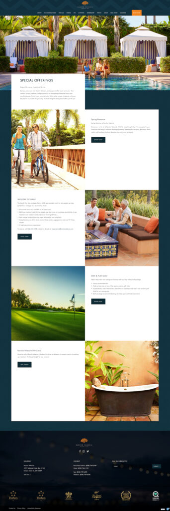
From here, the conversation moves to discussing specific page performance between the new and old websites, starting with the Specials Page.
[SM]: Overall, we are seeing a lower Bounce/Exit Rate on the new Specials page, but we are also seeing a lower Average Time on Page. Similar to the Homepage, we are seeing less people leave the site and interact in less time. Is this because people are finding what they want more efficiently? This makes them less likely to leave the site? The explanation for this page seems to be much different than the Homepage. The old website actually has more content, more headings and more descriptions about the specials that are offered. Differences in performance on this page don’t seem to be tied to content in the same way they were on the homepage.
[DS]: Well, there is certainly a huge difference in the design and user experience of these two pages. The new site is utilizing larger images and less copy. For the user, there is less to read and more to take in visually. While we might have less words on the page, the content is certainly much more engaging the way it’s laid out with larger images, it’s more captivating and there is less “dead” white space around the copy. We also see a larger call to action with a different color on the new site. The use of a text hierarchy is important here with large, bolded headlines and visual breaks between the content. Perhaps this allows us to better draw the user in to a focal point to those areas with less content and they are more likely to move on to the next step, rather than being disinterested and leaving the site.
[SM]: That’s an interesting take, but what about the initial land on the page? The new site has a large header image and we don’t actually see any of the specials and content on the page until we scroll down. The old site had the content start almost immediately, why might something like that perform better from a visual aspect?
[DS]: This page is actually leveraging some other architecture within the site, the main reason for the large header image is to provide a consistent experience to the user as they move through different pages. We don’t want to have one type of experience on one page and something that is visually very different on another page, people usually respond better to familiarity. By having the large header image throughout the site, the user should start to be familiar with the design as they get to the Specials page. Naturally, they should be used to scrolling down and that begins their journey of moving through the different specials. As we mentioned, utilizing white space, captivating imagery and limited content seems to help users move through the page and interact with the new Specials page in contrast to the more “list” version of the old page.
[DV]: It also seems like the Book Now button on the old site is a bit harder to find. Within a single fold of the page, we are able to see 3-4 specials and all of the content that goes with it. Some of those specials have a Book Now button and some of them are missing. I think the user might have an easier time getting lost on the old page where the new page draws your attention to the Book Now button a little bit better. The unfortunate part about the old site was that we didn’t have the flexibility to adjust elements within the page like this. The layout, headlines, blocks of text, photos that were used, all of that was very rigid and didn’t allow us to try and impact the visual flow that a user might have. This is a great example of how the functionality allows us to pivot to a different design and experience for the user.
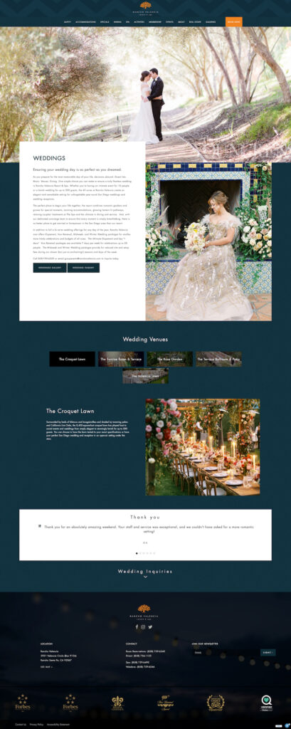
Wedding Page:
[SM]: In regards to the content, the biggest difference between the old and new wedding pages is that the old site also included Meetings. Ideally, we would like to have separate pages for those different services so that we can really focus our keyword targeting per page. By having both the weddings and meetings on the same page, it kind of “dilutes” the content that we can have about each individual service.
[DS]: From a design perspective, this is certainly a middle ground between the old, rigid website and a new website that we would like to build. While this certainly incorporates more visual details about the venues that are available and what a user might expect. Ultimately, we would like to build this out even more to help showcase the venues as that is a very unique aspect to this property. Our goal is to utilize “bite-sized” pieces of content and imagery that visually convey the details from each venue in a user flow similar to what has proven successful on this site. An even more customized version of the new wedding page will help us tell that story more efficiently.