Having a strong online presence is essential for any business, including hotels. As a hotel owner, you need to showcase your property, manage bookings, and provide a seamless user experience for potential guests. This is where Webflow puts you in the driver's seat, with user friendly navigation and website development tools.
Intuitive website design and customization
Webflow offers a user-friendly interface that allows hotel owners to create stunning, custom-designed websites without the need for coding knowledge. With its drag-and-drop functionality, you can easily arrange and design elements on your website, such as images, text, booking forms, and testimonials. This level of customization enables you to create a visually appealing website that aligns with your hotel's branding and style.
Natively mobile-first design
In today's mobile-driven world, having a website that adapts seamlessly to different screen sizes is crucial. Webflow provides responsive design options, ensuring that your hotel website looks and functions flawlessly on various devices, including smartphones and tablets. By delivering a consistent user experience across all platforms, you increase the chances of attracting potential guests and driving direct bookings.
Powerful search engine optimization capabilities
A well-optimized website is more likely to appear in search engine results, increasing your hotel's visibility and organic traffic. Webflow offers built-in SEO features that allow you to optimize your website's meta tags, headings, URLs, and alt tags for images. Additionally, you can create SEO-friendly sitemaps, add canonical tags, and enable SSL encryption for a secure browsing experience. By leveraging these SEO capabilities, you can improve your hotel's online visibility and attract more guests through organic search.
Easy to use content management system (CMS)
Webflow's integrated content management system allows hotel owners to effortlessly update and manage website content. You can easily add new pages, update room descriptions, showcase special offers, or publish blog posts to engage with your audience. The intuitive CMS interface provides a streamlined workflow, enabling you to keep your website up-to-date with the latest information about your hotel, amenities, and promotions.
Webflow provides hotel owners with a comprehensive platform to create stunning, user-friendly websites and take control of their online presence. With its intuitive design tools, mobile-responsive capabilities, booking management integration, SEO features, content management system, and analytics tracking, Webflow empowers hotel owners to attract more guests, streamline operations, and drive direct bookings. By harnessing the power of Webflow, you can elevate your hotel's online presence, improve guest experiences, and ultimately increase revenue in today's competitive hospitality industry.
Having a robust online presence is not just advantageous—it's essential. While social media platforms offer visibility and engagement, they shouldn't be your sole digital outpost. Instead, owning your website is paramount for establishing credibility, control, and long-term success online. Let's look at the top reasons why owning your website is crucial for your property.
Let's look at the top reasons why owning your website is crucial for your property.
Revenue Ownership: Your hotel's website serves as a crucial revenue-generating platform, acting as the digital storefront where potential guests discover, explore, and ultimately book their stay. If you don't own the website, you don’t own that source of revenue.
Control: When you own your website, you have full control over its design, content, functionality, and branding. This means you can tailor it to reflect your hotel's unique identity and effectively communicate your brand message to potential guests.
Flexibility: Owning your website gives you the flexibility to make changes and updates quickly and easily. Whether it's updating room rates, adding new photos, or implementing new features, you can do so without relying on a third party.
Customization: With ownership, you can customize your website to meet the specific needs of your hotel and your target audience. You can optimize it for search engines, integrate booking engines and other tools, and create a seamless user experience that encourages direct bookings.
Data Ownership: Perhaps most importantly, owning your website means you own the data generated by it. This includes information about your website visitors, their behavior, and their preferences. Having access to this data is invaluable for understanding your audience, refining your marketing strategies, and ultimately driving more bookings.
View our recent blogs on the importance of 1st party data:
Cost Savings: While there may be upfront costs associated with building and maintaining your own website, in the long run, owning your website can actually save you money. You won't have to pay ongoing fees to third-party platforms, and you'll have more control over your budget for website-related expenses.
Liability: As privacy laws, such as the General Data Protection Regulation (GDPR) and the California Consumer Privacy Act (CCPA), continue to grow, so does the importance of owning and managing your data responsibly. Owning your data is essential for compliance with privacy laws, accountability in data management, responsiveness to customer requests, mitigation of third-party risks, and enhancement of transparency and trust
Overall, owning your hotel website gives you autonomy, flexibility, and control over your online presence, ultimately helping you attract more guests and drive more direct bookings.Looking to take control of our website? Check out our Webflow services.
In the dynamic world of website development, understanding the differences and benefits of each website platform is crucial for the success of your online presence. Two popular options that often come into consideration are WordPress and Webflow. Each has its strengths and unique features, making the decision a matter of aligning your specific needs with the capabilities of the platform. Let's dive into a comparison of the two platforms to help you make your own conclusions.
Ease of Use:
WordPress: Known for its user-friendly interface, WordPress is widely embraced for its simplicity. With a vast library of plugins and themes, customization is accessible even for beginners.
Webflow: Offering a visual design interface, Webflow empowers users to create visually stunning websites without coding. The learning curve is moderate,
Design Capabilities:
WordPress: Good for design, but customization may require coding skills. Thousands of themes and plugins are available.making it suitable for those who want more control over design elements.
Webflow: Excellent for design-centric websites. Offers advanced styling options, animations, and responsive design without coding.
Flexibility and Customization:
WordPress: Renowned for its flexibility, WordPress allows extensive customization through plugins and themes. Developers can dive into the code for advanced modifications, offering unparalleled flexibility.
Webflow: With a focus on design, Webflow provides creative freedom in a visual environment. It's excellent for those who prioritize a design-centric approach, but customization might have some limitations compared to WordPress.
SEO Capabilities:
WordPress: With a plethora of SEO plugins and a strong foundation for content optimization, WordPress has a reputation for being search engine-friendly. It's a preferred choice for those prioritizing SEO.
Webflow: While Webflow offers SEO features, it may not be as robust as WordPress in this aspect. However, it provides sufficient tools for basic optimization.
Hosting and Maintenance:
WordPress: As a self-hosted platform, WordPress requires users to manage their hosting. While this grants more control, it also means handling regular updates and security measures.
Webflow: All-in-one hosting is a standout feature of Webflow. Users can enjoy hassle-free hosting, automatic updates, and security measures, making it a convenient choice for those who prefer a hands-off approach.
Cost Considerations:
WordPress: The core software is free, but expenses can accrue with premium themes, plugins, and hosting. It offers flexibility in budgeting based on individual needs.
Webflow: Pricing is based on usage, and while it might be costlier than some WordPress options, the all-inclusive package simplifies budgeting without the need for additional plugins or hosting.
Page Creation (after launch):
WordPress: WordPress is renowned for its user-friendly CMS, providing clients with the ability to create new pages seamlessly. Clients can navigate the intuitive dashboard, access the page editor, and use a straightforward block-based system to compose content. With its extensive library of plugins and themes, WordPress empowers clients to customize pages, add media, and manage their sites efficiently. The flexibility of WordPress makes it a popular choice for content-centric websites, including blogs, where clients can easily create and publish new blog posts, landing pages, or any other content-driven pages.
Webflow: Webflow, on the other hand, takes a slightly different approach. While Webflow is celebrated for its powerful design capabilities, it limits the creation of new pages directly within the editor mode. Unlike WordPress, where clients can add new pages on the fly, Webflow requires a more structured process. Clients typically need to work with designated templates and predefined structures, creating new pages in the Webflow Designer rather than directly within the CMS editor. This can be seen as a potential limitation for clients who prefer a more spontaneous, on-the-go approach to content creation.
E-commerce Integration:
WordPress: Has robust e-commerce capabilities with WooCommerce plugin, suitable for hotels with extensive online booking requirements.
Webflow: Is suitable for smaller e-commerce needs. Provides a native e-commerce solution.
Webflow excels in design-centric projects, while WordPress offers extensive customization and e-commerce capabilities, making it suitable for larger establishments with complex requirements. WordPress is a robust, flexible, and well-established platform suitable for various needs.
On the other hand, Webflow caters to those who prioritize design and seek an all-in-one solution. Consider your specific requirements, technical expertise, and long-term goals to make an informed decision. Whether you opt for the familiarity of WordPress or the design-centric approach of Webflow, both platforms offer opportunities to create a powerful and visually appealing online presence.
In the competitive landscape of the hospitality industry, hotels need to leverage every opportunity to attract and convert potential guests. One essential component is the hotel landing page. These dedicated web pages play a crucial role in guiding users through the guest journey, from initial interest to completing a booking. In this blog post, we will explore the importance of hotel landing pages, their key elements, best practices for design, and integration with digital marketing campaigns.
What Is a Landing Page?
A landing page is a stand-alone web page specifically designed to capture the attention and prompt action from visitors. It serves as a dedicated entry point for users who click on a specific advertisement, search engine result, or marketing campaign. Unlike a website's homepage, a landing page is focused on a specific goal, such as promoting a hotel offer, package, or event or encouraging visitors to take a particular action, such as booking a room, signing up for a newsletter, or filling out a form. Landing pages are designed to be concise, persuasive, and highly targeted to maximize conversions and drive designed outcomes.
Understanding the Importance of Hotel Landing Pages
Hotel landing pages serve as the entry point for potential guests and are designed to capture their attention, engage them with persuasive content, and ultimately lead them to take action. They provide a focused and tailored experience, highlighting the unique selling points of the hotel and its offerings. By optimizing landing pages, hotels can maximize conversions, ultimately driving bookings.
Hotel Landing Page Best Practices
Best practices for a landing page involve optimizing various elements to enhance its effectiveness in capturing visitors' attention and driving conversions. Here are some key points to consider.
Call-To-Action
Call to action is one of the most important features of any hotel landing page. Also known as CTAs, they offer actionable direction for the user. Without a clear CTA, users can be confused and as a result, you will see increased bounce rates, shorter sessions, lower conversions, and a less-than-ideal landing page experience.
Clear and Compelling Headlines
Headlines are essential components of any landing page. They quickly and easily tell the user what that landing page is about and can convey the value the page can offer them. Headlines also offer SEO benefits to help crawlers understand who the page is created for.
Social Proof
Humans are social creatures who seek validation from others to make decisions. Visitors will look to others to make important decisions, such as booking a room. Make sure to include your hotel ratings and testimonials when it matters to page visitors the most.
Captivating Visuals
Users will look at graphics and pictures to help conclude if your hotel, packages, and amenities are the right fit for them. For most, pictures are more important than copy. So ensure you can tell a visual story alongside captivating and compelling copy.
Consistent and Compelling Copy
The text on the page matters. A lot. Unfortunately, we have seen too many hoteliers hire lackluster writers who do not convey the real value of their hotel. When it comes to good copy, it has to be concise, branded, and value-driven. Ask yourself, "Is my website copy true to my brand? Can it quickly convey value?" If you answer "no" to either of those questions, it is time to revisit your copy.
Intuitive Design
Good design offers easy navigation and puts the right information in front of the user at times when it matters most. Good design will captivate your visitors and compel them to explore other parts of your website. This can establish strong relationships between you and your visitors. Ultimately resulting in lower bounce rates, greater conversion rates, and higher session duration times.
Don't Forget About Mobile
Mobile users have consistently been increasing over the last decade. Yet, the mobile user experience is still heavily neglected by hotels. If you are running any sort of social campaign, this is likely the very first user interaction. Make sure it offers a good user experience with these critical points:
Responsive Design Elements
Fast Load Time
Intuitive Mobile Navigation Layout
Conclusion
Hotel landing pages are crucial for attracting and covering potential guests in the competitive hospitality industry. These dedicated web pages serve as entry points, capturing visitors' attention and guiding them toward action. By creating well-thought-out landing pages, hotels can maximize conversions and drive bookings. Best practices for effective landing pages include clear CTA's, compelling headlines, persuasive and concise copy, social proof elements, captivating visuals, and straightforward & intuitive design. Following these practices helps hotels create engaging landing pages that drive conversions and achieve success in the hospitality industry.
This is a question I’m often asked by prospects looking to build a new hotel website and want confidence that they’re making the right decision. While WordPress isn’t the solution for every website, here are some reasons why we recommend the #1 content management system on the market.
WordPress Security in General
As the most popular content management system with over 40% market share, it's understandable why WordPress might be an attractive target for nefarious activity. Here’s why we rest easy:
World-wide community. With a world-wide, open source community, it's in everyone's best interest to find, share, and patch security vulnerabilities, which WordPress releases at frequent intervals.
Security plugins. We install a security plugin on all GCommerce hotel websites called Wordfence that helps protect against brute force password attempts, keeps a log of file changes and user logins, blocks suspicious IPs, and more.
Regular updates. We apply released security patches (using the WordPress update panel) on at least a monthly basis with our Preventative Maintenance service, and more frequently when a critical patch is needed. This keeps our site from being low hanging fruit for would-be attackers.
It's important to remember that hotel website software is organic and constantly evolving – it's not something that should be set and forgotten (which is a good way to become a target). While we can't control when or how software updates are released by WordPress or 3rd party plugin developers, we can control when and how these updates get applied. We offer a Preventative Maintenance service for clients that host with us to do just that – taking the stress and unknowns of what’s going to happen out of the equation.
For GCommerce, this means using testing environments to identify and address issues before they're applied to public-facing hotel websites. So while we cannot guarantee there will never be breakages (no one can), we do everything within reason to keep this reality of software development manageable for ourselves and our clients.
On the topic of WordPress plugins
“Okay, I see how I can make WordPress secure for my hotel’s website. How do I keep plugins from breaking?”
In a nutshell, plugins add functionality to your hotel’s website. They can do anything from adding a simple button, to adding an Instagram feed, to adding an entire eCommerce store. Considering the complexity of what you need and how mission-critical it is to your operation is a great way to keep your investment in perspective.
Before installing anything to our clients’ websites, these are the key factors we consider when evaluating plugins:
Age of the last plugin update. We look at the latest update date for a given plugin to determine if it is still receiving ongoing support. Depending on the complexity of the plugin, we will generally only use ones that have been updated within the last year or less.
Number of installations. We consider how many websites have the plugin installed and in use on their site using the WordPress plugin repository. The larger the user base, the more likely there will be community support forums and/or support provided by the plugin developer which means more bugs are being discovered and fixed across a variety of development environments. In other words, it's likely to be more robust and secure.
Premium options for complex or critical functionality, when needed. For functionality that is more complex or sensitive in nature (for example eCommerce plugins), we will generally recommend premium WordPress plugins for guaranteed support availability and responses.
Using a limited number of plugins. We strive to avoid using too many plugins on a site to reduce the risk of compatibility errors. Whenever possible (and when it makes sense), we will first write functionality as part of the WordPress theme before reaching for a plugin to further reduce the risk of breakages. A good target is to limit to 12 - 20 plugins, but there are always exceptions. Just understand the more you add the more likely you may need to come up with creative compatibility solutions.
We know how frustrating it can be when a WordPress plugin that was working perfectly fine last week seems to stop working for no good reason. And while it’s tempting to say “Just change it back! It was working before!”, you run the risk of your out-of-date software being exploited.
By keeping on top of updates so your version changes are small, dealing with these incremental breakages (which is normal) will keep the long term maintenance cost lower. It’s a lot like getting an oil change for your car. If you change it regularly you’ll get better mileage and performance out of it, with disastrous consequences if you let the oil run dry and melt your engine instead.
On the topic of WordPress themes
Similar to plugins, WordPress themes (also sometimes referred to as commercial templates), focus on the look and feel of your hotel’s website, with some functionality baked in. Wherever the theme functionality ends is where plugins begin.
Similar rules apply when selecting a theme, especially the support. As far as expected mileage goes, I’ve found the lifespan can vary drastically from client to client. My rule of thumb – if you want to take advantage of the latest speed enhancements and stand out from your competition, you should consider revisiting your website needs every 3 - 5 years. (I mean, if your smartphone is considered ancient after 2 years… you get the idea.)
Why Should I Use WordPress For My Hotel’s Website?
There are many, many reasons why WordPress is a go-to for our company. Here are some of our favorite reasons that impact our and our clients’ bottom line:
Access to quality developers. There are plenty of qualified WordPress developers available anywhere, making it easy to find, vet, and hire support when you need it. While your current developer is hopefully providing all the services you need, having assurance that external support is available to maintain your site should you need it is a great insurance policy.
More affordable long term maintenance. WordPress applies frequent, incremental patches which tends to make compatibility issues less severe and easier to address when they do arise (and they will). But because there is better WordPress developer availability, it's more likely these issues can be addressed in a timely manner and at a reasonable cost (vs. paying premium for developers in limited supply for other platform solutions like ExpressionEngine or Magento).
Reduced staff training. The longer WordPress is used, the more likely it is you will have future employees that already have familiarity with the content management system, making training faster, more accessible, and easier to work with.
No recurring license fees and includes upgrades. WordPress has no recurring license fees for the core software and users get to enjoy the benefit of having functionality upgrades for free. The trade off however is that the onus of keeping the software up-to-date is the responsibility of the site owner, unlike with a proprietary system.
Still not convinced? That’s okay. WordPress isn’t for everyone and it’s not appropriate for every site. But hopefully you now have a more informed understanding of why it might be the right choice for you. Thanks for reading!
Have more questions? Feel free to reach out to GCommerce’s hotel website experts for more information.
On a cold winter day in January of 2021, a group of elite developers, designers and digital marketers gathered in an encrypted and secret online meeting to evaluate two versions of websites for the Rancho Valencia Resort & Spa. This super confidential and ultra-top-secret meeting was recorded and the contents have been acquired by GCommerce Solutions. Here, we will lay out the trade secrets discussed by this exclusive team so that you too can build a top performing hotel website.
Before we get into the details from the meeting, it is important to have some background on the websites. Rancho Valencia Resort & Spa is located in Rancho Santa Fe, California and is one of the most awarded luxury resorts in the world. In 2019, the Resort needed to change websites and GCommerce quickly built and launched a site within a matter of weeks. This was a temporary measure until a more sophisticated website could be built for the property. At the start of 2020, a new website was launched and that is the one that is currently online in February of 2021. In reference to this article, the old, 2019 version of the website can still be viewed in the Web Archive.
In 2019, we had one version of the website and in 2020 we had another. This easily allowed us to compare performance between the different sites. Unfortunately, the Covid-19 pandemic certainly had an impact on demand and stay at the property. However, general performance on the website around Bounce and Exit rates, Avg. Time on Page and Conversion Rates can give us an idea on if a website is better suited to meet the goals of a property and which individual pages are helping to support those goals. Overall, Rancho Valencia's website had a:
22% decrease in bounce rate
7% increase in conversion rate
Less people are leaving the site and more people are booking. If 2020 had the same number of visitors to the website as 2019, a 7% increase in conversion rate would have equaled an additional $250,000 in revenue to the property.
We have two different versions of a website, but what is it about the second version of the site that works well? What lessons can we take as we set out to launch the final version of Rancho Valencia’s website later in 2021? What can this teach us about all of our website builds?
We have a short checklist below of things to keep in mind and a transcription of the recording acquired by GCommerce.
Design
Utilize large, captivating images.
Photography and videography should be chosen wisely to convey desired lifestyle.
Visual breaks and design to help the user move through the content.
Be strategic with “white” or “dead” space on the site.
Text hierarchy – what content helps the user move through the page?
Development
Flexibility within the content, images, text areas, calls to actions, etc.
Being too rigid can hinder the functionality of the site.
Provide a consistent experience to the user across different pages.
Focus the build on working in unison: supporting content, brand, lifestyle, design, etc.
Optimize asset usage for tracking (Google Analytics, Facebook pixels, etc.)
Search
Research keywords with high volume that match qualifications for your property.
Unique and keyword rich content on the website.
Descriptive text to match the brand and amenities offered.
Utilize keyword rich Headings.
Separate pages based on amenities – different pages for Spa, Wedding, Meeting, etc.
Optimize for best practice with Search Engines
Search Marketers [SM]:Right off the bat, the thing that really stands out is the difference in content. The new site has several sections of text, keyword rich headings and areas to let a user and a search engine know what the page is about and all of the services offered. This is a really unique property with a wide range of amenities, being able to host enough content to give each area of service the descriptions that they need is a major difference between the two sites.
Development Team [DV]:The biggest challenge with the new website was getting them up and running quickly onto something that showed better to their guests. The architecture that we used here was similar to one we’ve used on other sites; it’s highly customizable, which helps make easy updates to content, packages, images, text, etc. The 2019 version of the site was very inflexible; making any changes or updates required a developer and even then, it was very “locked-down” and there just wasn’t much we could do to add more to the user experience in terms of functionality, which is why we see so much more content on the new site.
Design Team [DS]: We completely agree, the newer version of the site allows for much more flexibility in the content and photos. The old website was very “boxy” and had a 1970’s-Partridge-Family feel to it. The new website allows us to showcase a completely different user experience. The photography and videography on the new website is visually more appealing within the content areas that they have separated on the site, which matches current design trends where the approach is to showcase the “lifestyle” that one might experience while staying at the property. One of the things that we really like about this type of architecture is the unity between the design and development functionality that allows us to showcase the type of experience and lifestyle that the property is trying to project.
[DV]: That’s exactly how we would classify this, everything has to work together. We can’t just put keywords on a page and rank for those if the site doesn’t allow for that text to be housed. You have to have the functionality so that the Search Engine Optimization (SEO) can perform the way it’s supposed to. But we also have to match that visually for the property. If the resort is a highly awarded luxury resort, the design needs to convey that in a way that enhances their brand. The flexible functionality within the build is what allows all of this to come together, rank well with search engines and perform well with their potential guests.
[SM]:It also seems like the additional content is helping the new website rank much higher on search engines. We have been tracking relative ranking positions for keywords within SEMRush. On the old site, we did not have many terms ranking on the 1st and 2nd pages of the Google Search Engine Result Page (SERP) and we had almost no results within the Map Pack for Google. Alternatively, the new website is ranking much better than the old website with many competitive market terms showing results in the top 2 pages and we even have results within the organic Map Pack:
Rancho Valencia Map Pack Search Results
The better performance and more content on the website seem to be translating into higher rankings, more traffic and better performance on search engines. Many hotels spend thousands of dollars to show ads within the Map Pack and at the top of the Google SERP. Being able to rank their site on Google Organically is a benefit that is hard to put into words, it’s a massive achievement.
[DV]: Another aspect that might help us rank better is with more efficient asset usage for tracking. The old site wasn’t quite as well-organized with tracking elements. Things that help us track in Google Analytics, Facebook pixels, those sorts of things are running bit better on the new website. This can help with things like load time and ensuring that multiple elements on a page are loading at similar times, translating to a better user experience.
[SM]:Within the new website statistics, we are seeing signs that performance on the Homepage has increased significantly. Overall, we are seeing more Pageviews on the Homepage, but less Sessions overall to the website. We also saw a decrease in Bounce Rates and Exit Rates while the Average Time on the Homepage decreased. With more Pageviews, less Bounces/Exits and less time on site, that is a clear indication that more people are interacting with the site. They are coming back to the homepage on repeat visits and leaving the website less often. All of these are signs of an improved user experience within the site.
From here, the conversation moves to discussing specific page performance between the new and old websites, starting with the Specials Page.
[SM]:Overall, we are seeing a lower Bounce/Exit Rate on the new Specials page, but we are also seeing a lower Average Time on Page. Similar to the Homepage, we are seeing less people leave the site and interact in less time. Is this because people are finding what they want more efficiently? This makes them less likely to leave the site? The explanation for this page seems to be much different than the Homepage. The old website actually has more content, more headings and more descriptions about the specials that are offered. Differences in performance on this page don’t seem to be tied to content in the same way they were on the homepage.
[DS]: Well, there is certainly a huge difference in the design and user experience of these two pages. The new site is utilizing larger images and less copy. For the user, there is less to read and more to take in visually. While we might have less words on the page, the content is certainly much more engaging the way it’s laid out with larger images, it’s more captivating and there is less “dead” white space around the copy. We also see a larger call to action with a different color on the new site. The use of a text hierarchy is important here with large, bolded headlines and visual breaks between the content. Perhaps this allows us to better draw the user in to a focal point to those areas with less content and they are more likely to move on to the next step, rather than being disinterested and leaving the site.
[SM]: That’s an interesting take, but what about the initial land on the page? The new site has a large header image and we don’t actually see any of the specials and content on the page until we scroll down. The old site had the content start almost immediately, why might something like that perform better from a visual aspect?
[DS]: This page is actually leveraging some other architecture within the site, the main reason for the large header image is to provide a consistent experience to the user as they move through different pages. We don’t want to have one type of experience on one page and something that is visually very different on another page, people usually respond better to familiarity. By having the large header image throughout the site, the user should start to be familiar with the design as they get to the Specials page. Naturally, they should be used to scrolling down and that begins their journey of moving through the different specials. As we mentioned, utilizing white space, captivating imagery and limited content seems to help users move through the page and interact with the new Specials page in contrast to the more “list” version of the old page.
[DV]: It also seems like the Book Now button on the old site is a bit harder to find. Within a single fold of the page, we are able to see 3-4 specials and all of the content that goes with it. Some of those specials have a Book Now button and some of them are missing. I think the user might have an easier time getting lost on the old page where the new page draws your attention to the Book Now button a little bit better. The unfortunate part about the old site was that we didn’t have the flexibility to adjust elements within the page like this. The layout, headlines, blocks of text, photos that were used, all of that was very rigid and didn’t allow us to try and impact the visual flow that a user might have. This is a great example of how the functionality allows us to pivot to a different design and experience for the user.
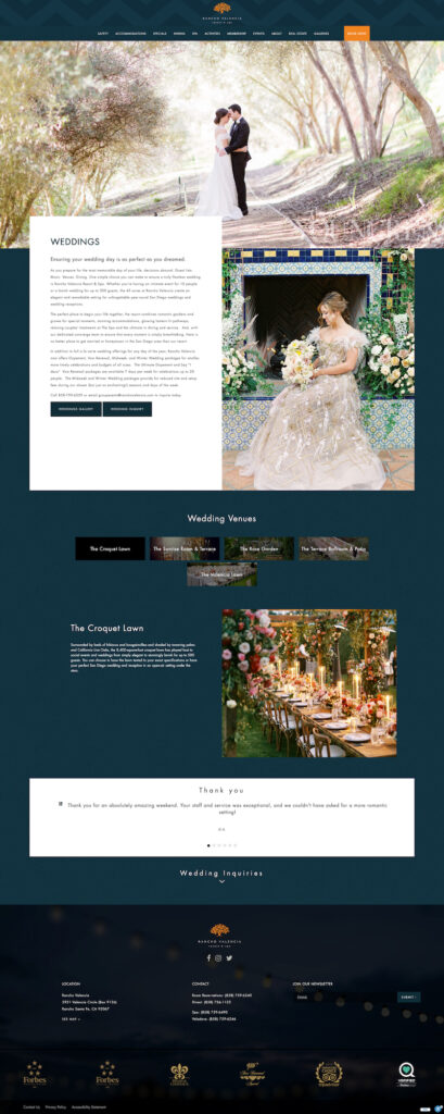
Wedding Page:
[SM]: In regards to the content, the biggest difference between the old and new wedding pages is that the old site also included Meetings. Ideally, we would like to have separate pages for those different services so that we can really focus our keyword targeting per page. By having both the weddings and meetings on the same page, it kind of “dilutes” the content that we can have about each individual service.
[DS]: From a design perspective, this is certainly a middle ground between the old, rigid website and a new website that we would like to build. While this certainly incorporates more visual details about the venues that are available and what a user might expect. Ultimately, we would like to build this out even more to help showcase the venues as that is a very unique aspect to this property. Our goal is to utilize “bite-sized” pieces of content and imagery that visually convey the details from each venue in a user flow similar to what has proven successful on this site. An even more customized version of the new wedding page will help us tell that story more efficiently.