

Intro Text. You can choose to break this text into columns if you like. By design, this site does not really use the gallery but it is here as an option. Lorem ipsum dolor sit amet, consectetur adipiscing elit, sed do eiusmod tempor incididunt ut labore et dolore magna aliqua.
HEADING 1
Heading 2
Heading 3
Heading 4
Heading 5
Heading 6
General Body Copy
Maecenas pulvinar ut velit vel tristique. Phasellus lacinia felis neque, sed bibendum felis lacinia nec. Suspendisse consequat lorem nisi, lacinia tincidunt eros efficitur eu. Etiam vel diam lectus. Nullam nec turpis in justo faucibus pellentesque in non sem. Pellentesque urna enim, hendrerit sed varius non, volutpat sed leo. Morbi aliquam velit at quam bibendum iaculis vel et purus. Nulla placerat nibh turpis, a maximus libero ullamcorper fermentum. Vivamus ut venenatis mauris. Nam lacinia eleifend dui vitae varius. Suspendisse gravida urna quis elit aliquet aliquam. Nulla pellentesque odio in urna egestas tempor. Donec ut semper lacus, a sagittis tellus.
Nulla facilisi. Phasellus neque dui, finibus ac libero et, molestie suscipit urna. Vivamus auctor tristique risus, ut eleifend urna aliquet sit amet. Praesent ultricies vestibulum justo, pretium dictum mi mollis in. Sed lectus metus, mattis in ullamcorper sit amet, vehicula et sapien. Mauris id nunc ornare, sollicitudin felis ut, rhoncus lectus. Curabitur vulputate mi a arcu fermentum, vitae pulvinar risus elementum.
Duis ut viverra nisl. Morbi sagittis tincidunt finibus. Vestibulum scelerisque luctus diam, eu dictum erat posuere nec. Vivamus non leo gravida, pharetra purus in, porta odio. Proin non dictum nulla, vitae finibus tortor. Maecenas ultricies eros sapien, dictum convallis quam consectetur sit amet. Pellentesque lacus velit, ullamcorper quis lectus eu, aliquam cursus purus. Donec pharetra sem lorem, ac luctus nulla eleifend non.
Color Classes
The site uses a number of classes that are useful for changing background colors, foreground colors, hover colors, etc. You can use these class names in the "Button" shortcode with the "class=xx" attribute, or anywhere you need to input custom HTML. The general format of all of these class names is as follows:
[colorcode][hover (optional)]
Color 1, Color 2, Black, White, and other colors are all controlled via Settings -> Theme Options -> Colors.
Foreground Colors
fg-c1 Change the foreground of the element to Color 1
fg-c2 Change the foreground of the element to Color 2
fg-body Change the foreground of the element to the Body Color
fg-white Change the foreground of the element to the theme White color
fg-black Change the foreground of the element to the theme Black color
Foreground Colors - Hover
fg-c1-hover Change the foreground of the element to Color 1 on hover
fg-c2-hover Change the foreground of the element to Color 2 on hover
fg-body-hover Change the foreground of the element to Theme Body Color on hover
fg-white-hover Change the foreground of the element to Theme White Color on hover
fg-black-hover Change the foreground of the element to Theme Black Color on hover
Background Colors
bg-c1 Change the background of the element to Color 1
bg-c2 Change the background of the element to Color 2
bg-body Change the background of the element to Body Color
bg-white Change the background of the element to Theme White
bg-black Change the background of the element to Theme Black
Background Color and Opacities
bg-c1-opacity Change the background of the element to Color 1, partially transparent
bg-c2-opacity Change the background of the element to Color 2, partially transparent
bg-white-opacity Change the background of the element to Theme White, partially transparent
bg-black-opacity Change the background of the element to Theme Black, partially transparent
Background Color and Opacities - Hover
bg-c1-opacity-hover Change the background of the element to Color 1, partially transparent on hover
bg-c2-opacity-hover Change the background of the element to Color 2, partially transparent on hover
bg-white-opacity-hover Change the background of the element to Theme White, partially transparent on hover
bg-black-opacity-hover Change the background of the element to Theme Black, partially transparent on hover
Background Colors - Hover
bg-c1-hover Change the background of the element to Color 1 on hover
bg-c2-hover Change the background of the element to Color 2 on hover
bg-white-hover Change the background of the element to Theme White on hover
bg-black-hover Change the background of the element to Theme White on hover
Border Colors
border-c1 Add a border to the element with color set to Color 1
border-c2 Add a border to the element with color set to Color 2
border-white Add a border to the element with color set to Theme White
border-black Add a border to the element with color set to Theme Black
Single Borders
border-top-c1 Add a border to the element with color set to Color 1 at the top
border-top-c2 Add a border to the element with color set to Color 2 at the top
border-top-white Add a border to the element with color set to Theme White at the top
border-top-black Add a border to the element with color set to Theme Black at the top
border-left-c1 Add a border to the element with color set to Color 1 at the left
border-left-c2 Add a border to the element with color set to Color 2 at the left
border-left-white Add a border to the element with color set to Theme White at the left
border-left-black Add a border to the element with color set to Theme Black at the left
border-right-c1 Add a border to the element with color set to Color 1 at the right
border-right-c2 Add a border to the element with color set to Color 2 at the right
border-right-white Add a border to the element with color set to Theme White at the right
border-right-black Add a border to the element with color set to Theme Black at the right
border-bottom-c1 Add a border to the element with color set to Color 1 at the bottom
border-bottom-c2 Add a border to the element with color set to Color 2 at the bottom
border-bottom-white Add a border to the element with color set to Theme White at the bottom
border-bottom-black Add a border to the element with color set to Theme Black at the bottom
Border Colors: hover
border-c1-hover Add a border to the element with color set to Color 1 when hovered over
border-c2-hover Add a border to the element with color set to Color 2 when hovered over
border-white-hover Add a border to the element with color set to Theme White when hovered over
border-black-hover Add a border to the element with color set to Theme Black when hovered over
CTAs are now Gutenberg blocks, able to be added to any Gutenberg editor slot. Search for "CTA" or "GCom" and choose the relevant options.
Lorem ipsum dolor sit amet, consectetur adipiscing elit, sed do eiusmod tempor incididunt ut labore et dolore magna aliqua. Ut enim ad minim veniam, quis nostrud exercitation ullamco laboris nisi ut aliquip ex ea commodo consequat.
Duis aute irure dolor in reprehenderit in voluptate velit esse cillum dolore eu fugiat nulla pariatur. Excepteur sint occaecat cupidatat non proident, sunt in culpa qui officia deserunt mollit anim id est laborum.
Bold Italics Bold-Italics
- Bulleted list 1
- Bulleted list 2
- Bulleted list 3
- Numbered list 1
- Numbered list 2
- Numbered list 3
This is a block quote.
CTAs / Buttons
You have a variety of button styles to choose from. Centering a button in a default block is tricky, you have to put it in a group, then add the "center" class to the group under the "Advanced" tab to the right while the group is selected.
Checkerboards
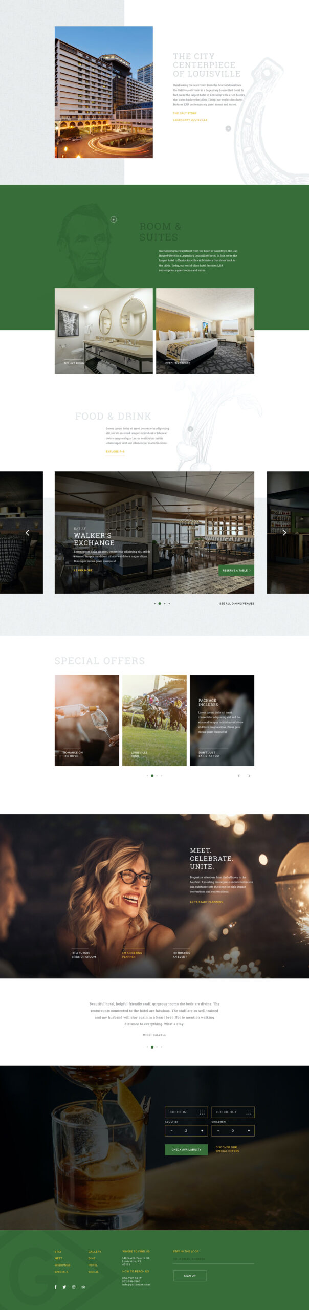
We have several different checkerboard layouts to choose from.
Default (each column is 50% width, image corners touch)


Checkerboard: Standard
Lorem ipsum dolor sit amet, consectetur adipiscing elit, sed do eiusmod tempor incididunt ut labore et dolore magna aliqua. Ut enim ad minim veniam, quis nostrud exercitation ullamco laboris nisi ut aliquip ex ea commodo consequat.
Second Row Headline
Lorem ipsum dolor sit amet, consectetur adipiscing elit, sed do eiusmod tempor incididunt ut labore et dolore magna aliqua.
Offset (text column is 50% width, there's a gap between columns & rows, images are 360px tall by default)
Headline Row 1
Lorem ipsum dolor sit amet, consectetur adipiscing elit, sed do eiusmod tempor incididunt ut labore et dolore magna aliqua.

Row 2 Headline
Lorem ipsum dolor sit amet, consectetur adipiscing elit, sed do eiusmod tempor incididunt ut labore et dolore magna aliqua.
Tall Blocks (text column is 45% width, all rows are at least 640px tall)

Headline Row 1
Lorem ipsum dolor sit amet, consectetur adipiscing elit, sed do eiusmod tempor incididunt ut labore et dolore magna aliqua.

Headline Row 2
Lorem ipsum dolor sit amet, consectetur adipiscing elit, sed do eiusmod tempor incididunt ut labore et dolore magna aliqua.
Gcom Awards Strip
Can be left-, right-, or center-aligned.
Gcom Big Center Slider
One big slider image in the middle, with the others to the sides. Can accept a background image or background color.


Post Excerpts


Most Recent Posts
You can leave it to the default of the three most-recently published posts, or you can pick a category, or you can choose to limit posts from a specific Service.
Integrated Headline

Gcommerce Caption Over Image
Most useful in a standard column, where you can add other content to the right. It's intended to have text over a colored bar at the bottom of the image.

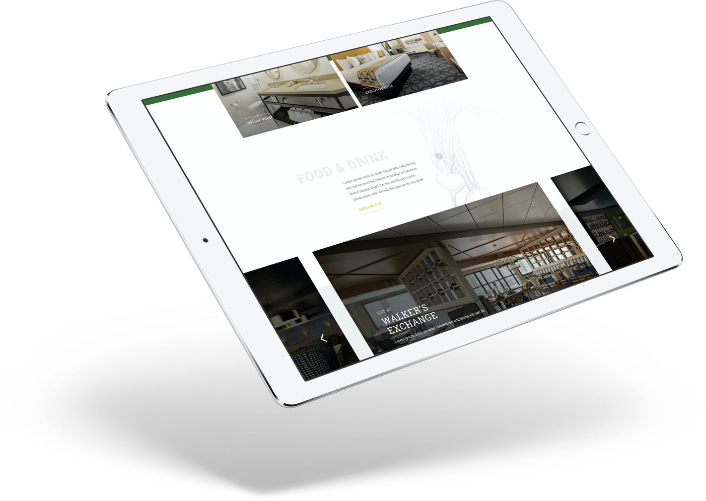
Clifton Style Content Slider
Gcommerce Content Band Over Image
Intended to be a full-width row with a background image, and a colored-bg block of text over that, either on the left or right side.
Gcommerce Content Grid
Content laid out in a grid, intended for logos though it can also be used for plain text. Each grid section can be clickable or not, and can contain a headline, text, and / or image.
Optional Integrated Headline

Gcommerce Expanding Columns
Gcommerce Form Block
Meant for styling nice-looking forms on the site. Can take a background image.
Integrated Form Block Headline
Lorem ipsum dolor sit amet, consectetur adipiscing elit, sed do eiusmod tempor incididunt ut labore et dolore magna aliqua. Ut enim ad minim veniam, quis nostrud exercitation ullamco laboris nisi ut aliquip ex ea commodo consequat. Duis aute irure dolor in reprehenderit in voluptate velit esse cillum dolore eu fugiat nulla pariatur. Excepteur sint occaecat cupidatat non proident, sunt in culpa qui officia deserunt mollit anim id est laborum.
Gcommerce Free Text Block
Integrated Headline
The free text block is like the default WordPress editor that can be placed anywhere, have a background color, variable width, and changeable text color.
- Bulleted List 1
- Item 2
- And this other thing here
Or
- Numbered List 1
- Item 2
- Other thing here
“Lorem ipsum dolor sit amet, consectetur adipiscing elit, sed do eiusmod tempor incididunt ut labore et dolore magna aliqua. Ut enim ad minim veniam, quis nostrud exercitation ullamco laboris nisi ut aliquip ex ea commodo consequat. Duis aute irure dolor in reprehenderit in voluptate velit esse cillum dolore eu fugiat nulla pariatur. Excepteur sint occaecat cupidatat non proident, sunt in culpa qui officia deserunt mollit anim id est laborum.”
Responsive Video
By default videos in WordPress are hard-set to certain heights and widths. Using this block, you can get an embedded video to be responsive so it is always 100% width and automatically sets the proper height to retain the right aspect ratio.
Gcommerce Content Frames
Essentially these are pre-designed layouts meant to accommodate different lengths of text with auto-responsive and auto-sized images. So no matter how tall the text column is, the image(s) in the other will scale to the same height.
1-Big
Intended for cases where you have a relatively short Frame of text with one big image to the side.
“Lorem ipsum dolor sit amet, consectetur adipiscing elit, sed do eiusmod tempor incididunt ut labore et dolore magna aliqua. Ut enim ad minim veniam, quis nostrud exercitation ullamco laboris nisi ut aliquip ex ea commodo consequat. Duis aute irure dolor in reprehenderit in voluptate velit esse cillum dolore eu fugiat nulla pariatur. Excepteur sint occaecat cupidatat non proident, sunt in culpa qui officia deserunt mollit anim id est laborum.”
Section 1.10.32 of “de Finibus Bonorum et Malorum”, written by Cicero in 45 BC
“Sed ut perspiciatis unde omnis iste natus error sit voluptatem accusantium doloremque laudantium, totam rem aperiam, eaque ipsa quae ab illo inventore veritatis et quasi architecto beatae vitae dicta sunt explicabo. Nemo enim ipsam voluptatem quia voluptas sit aspernatur aut odit aut fugit, sed quia consequuntur magni dolores eos qui ratione voluptatem sequi nesciunt. Neque porro quisquam est, qui dolorem ipsum quia dolor sit amet, consectetur, adipisci velit, sed quia non numquam eius modi tempora incidunt ut labore et dolore magnam aliquam quaerat voluptatem. Ut enim ad minima veniam, quis nostrum exercitationem ullam corporis suscipit laboriosam, nisi ut aliquid ex ea commodi consequatur? Quis autem vel eum iure reprehenderit qui in ea voluptate velit esse quam nihil molestiae consequatur, vel illum qui dolorem eum fugiat quo voluptas nulla pariatur?”
1-over-2
Intended for cases where you have a fairly lengthy Frame of text; though the images will always scale to fit the height of the text block, the layout does not look as good with just a few lines of copy.
“Lorem ipsum dolor sit amet, consectetur adipiscing elit, sed do eiusmod tempor incididunt ut labore et dolore magna aliqua. Ut enim ad minim veniam, quis nostrud exercitation ullamco laboris nisi ut aliquip ex ea commodo consequat. Duis aute irure dolor in reprehenderit in voluptate velit esse cillum dolore eu fugiat nulla pariatur. Excepteur sint occaecat cupidatat non proident, sunt in culpa qui officia deserunt mollit anim id est laborum.”
Section 1.10.32 of “de Finibus Bonorum et Malorum”, written by Cicero in 45 BC
“Sed ut perspiciatis unde omnis iste natus error sit voluptatem accusantium doloremque laudantium, totam rem aperiam, eaque ipsa quae ab illo inventore veritatis et quasi architecto beatae vitae dicta sunt explicabo. Nemo enim ipsam voluptatem quia voluptas sit aspernatur aut odit aut fugit, sed quia consequuntur magni dolores eos qui ratione voluptatem sequi nesciunt. Neque porro quisquam est, qui dolorem ipsum quia dolor sit amet, consectetur, adipisci velit, sed quia non numquam eius modi tempora incidunt ut labore et dolore magnam aliquam quaerat voluptatem. Ut enim ad minima veniam, quis nostrum exercitationem ullam corporis suscipit laboriosam, nisi ut aliquid ex ea commodi consequatur? Quis autem vel eum iure reprehenderit qui in ea voluptate velit esse quam nihil molestiae consequatur, vel illum qui dolorem eum fugiat quo voluptas nulla pariatur?”
1-over-2-short
1-over-2-short (text on one side, stack of images on the other with one large image over two short ones). Intended for cases where you have a relatively short Frame of text; though the images will always scale to fit the height of the text block, the layout does not look as good with lots of lines of copy.
Lorem ipsum dolor sit amet, consectetur adipiscing elit, sed do eiusmod tempor incididunt ut labore et dolore magna aliqua. Ut enim ad minim veniam, quis nostrud exercitation ullamco laboris nisi ut aliquip ex ea commodo consequat. Duis aute irure dolor in reprehenderit in voluptate velit esse cillum dolore eu fugiat nulla pariatur. Excepteur sint occaecat cupidatat non proident, sunt in culpa qui officia deserunt mollit anim id est laborum.
“Lorem ipsum dolor sit amet, consectetur adipiscing elit, sed do eiusmod tempor incididunt ut labore et dolore magna aliqua. Ut enim ad minim veniam, quis nostrud exercitation ullamco laboris nisi ut aliquip ex ea commodo consequat. Duis aute irure dolor in reprehenderit in voluptate velit esse cillum dolore eu fugiat nulla pariatur. Excepteur sint occaecat cupidatat non proident, sunt in culpa qui officia deserunt mollit anim id est laborum.”
Section 1.10.32 of “de Finibus Bonorum et Malorum”, written by Cicero in 45 BC
“Sed ut perspiciatis unde omnis iste natus error sit voluptatem accusantium doloremque laudantium, totam rem aperiam, eaque ipsa quae ab illo inventore veritatis et quasi architecto beatae vitae dicta sunt explicabo. Nemo enim ipsam voluptatem quia voluptas sit aspernatur aut odit aut fugit, sed quia consequuntur magni dolores eos qui ratione voluptatem sequi nesciunt. Neque porro quisquam est, qui dolorem ipsum quia dolor sit amet, consectetur, adipisci velit, sed quia non numquam eius modi tempora incidunt ut labore et dolore magnam aliquam quaerat voluptatem. Ut enim ad minima veniam, quis nostrum exercitationem ullam corporis suscipit laboriosam, nisi ut aliquid ex ea commodi consequatur? Quis autem vel eum iure reprehenderit qui in ea voluptate velit esse quam nihil molestiae consequatur, vel illum qui dolorem eum fugiat quo voluptas nulla pariatur?”
1-over-1
1-over-1 (text on one side, two equally sized images stacked on top of each other in the other). intended for cases where you have a moderate sized text block; though the images will always scale to fit the height of the text block, the layout does not look as good with just a few lines of copy or with too big a block.
“Lorem ipsum dolor sit amet, consectetur adipiscing elit, sed do eiusmod tempor incididunt ut labore et dolore magna aliqua. Ut enim ad minim veniam, quis nostrud exercitation ullamco laboris nisi ut aliquip ex ea commodo consequat. Duis aute irure dolor in reprehenderit in voluptate velit esse cillum dolore eu fugiat nulla pariatur. Excepteur sint occaecat cupidatat non proident, sunt in culpa qui officia deserunt mollit anim id est laborum.”
Section 1.10.32 of “de Finibus Bonorum et Malorum”, written by Cicero in 45 BC
“Sed ut perspiciatis unde omnis iste natus error sit voluptatem accusantium doloremque laudantium, totam rem aperiam, eaque ipsa quae ab illo inventore veritatis et quasi architecto beatae vitae dicta sunt explicabo. Nemo enim ipsam voluptatem quia voluptas sit aspernatur aut odit aut fugit, sed quia consequuntur magni dolores eos qui ratione voluptatem sequi nesciunt. Neque porro quisquam est, qui dolorem ipsum quia dolor sit amet, consectetur, adipisci velit, sed quia non numquam eius modi tempora incidunt ut labore et dolore magnam aliquam quaerat voluptatem. Ut enim ad minima veniam, quis nostrum exercitationem ullam corporis suscipit laboriosam, nisi ut aliquid ex ea commodi consequatur? Quis autem vel eum iure reprehenderit qui in ea voluptate velit esse quam nihil molestiae consequatur, vel illum qui dolorem eum fugiat quo voluptas nulla pariatur?”
Gcommerce Fancy Lists
"Circled" lists will make a gray circle around each bullet. If you leave the bullets blank, they will automatically fill in with numbers in order. "Plain" lists will just put whatever bullet in you like with no formatting. "Large" is for when you want uncircled, very big text you type in to serve as the bullet.
Left Column Headline
- 1Bullet 1 Text
- 2Bullet 2 Text
Right Column Headline
- GRight Column Bullet 1
- !Right Column Bullet 1
Gcommerce FAQ
Integrated Headline
Optional text area for introductory copy.
Because it is the bee’s knees. It allows for toggling of questions and answers.
This block will automatically create structured data for all questions and answers. You don’t have to do anything extra.
Why yes they do! Or no they don’t, I don’t know, go bug an entomologist.
Gcommerce Floaty Graphic
Floaty Graphic
Headline
“Lorem ipsum dolor sit amet, consectetur adipiscing elit, sed do eiusmod tempor incididunt ut labore et dolore magna aliqua. Ut enim ad minim veniam, quis nostrud exercitation ullamco laboris nisi ut aliquip ex ea commodo consequat. Duis aute irure dolor in reprehenderit in voluptate velit esse cillum dolore eu fugiat nulla pariatur. Excepteur sint occaecat cupidatat non proident, sunt in culpa qui officia deserunt mollit anim id est laborum.”
Gcommerce Services Block
Mostly used on the archive page for Services and on the home page, but any time you want to drop in a quick section highlighting a given service we offer – say, in a landing page for a promo or for a newsletter signup or blog post – you can use this block.
Design & Creative
Social Media Marketing
Gcommerce Thu Horizontal Gallery


Gcommerce Image Break
Like a parallax section, but intended for two half-width titles that are actually links to other content. Generally set to full width for the overall block. It's useful for a visual break in a page that otherwise has a lot of copy.
Gcommerce Job Listings Block
You might want to add in one or more job listings to a blog post or other page aside from the main jobs archive. You can use this block to list either one or all job postings.
Gcommerce Brewster Mixed Content Slider

Gcommerce Offset Text Columns
Two columns of text shifted to the right, while a main headline remains offset to the left.
Big Headline
Offset text columns text block. Lorem ipsum dolor sit amet, consectetur adipiscing elit, sed do eiusmod tempor incididunt ut labore et dolore magna aliqua. Ut enim ad minim veniam, quis nostrud exercitation ullamco laboris nisi ut aliquip ex ea commodo consequat. Duis aute irure dolor in reprehenderit in voluptate velit esse cillum dolore eu fugiat nulla pariatur. Excepteur sint occaecat cupidatat non proident, sunt in culpa qui officia deserunt mollit anim id est laborum.”
Section 1.10.32 of “de Finibus Bonorum et Malorum”, written by Cicero in 45 BC
“Sed ut perspiciatis unde omnis iste natus error sit voluptatem accusantium doloremque laudantium, totam rem aperiam, eaque ipsa quae ab illo inventore veritatis et quasi architecto beatae vitae dicta sunt explicabo. Nemo enim ipsam voluptatem quia voluptas sit aspernatur aut odit aut fugit, sed quia consequuntur magni dolores eos qui ratione voluptatem sequi nesciunt. Neque porro quisquam est, qui dolorem ipsum quia dolor sit amet, consectetur, adipisci velit, sed quia non numquam eius modi tempora incidunt ut labore et dolore magnam aliquam quaerat voluptatem. Ut enim ad minima veniam, quis nostrum exercitationem ullam corporis suscipit laboriosam, nisi ut aliquid ex ea commodi consequatur? Quis autem vel eum iure reprehenderit qui in ea voluptate velit esse quam nihil molestiae consequatur, vel illum qui dolorem eum fugiat quo voluptas nulla pariatur?
Gcommerce Our Work Block
Used to highlight "Our Work" posts on other pages or blog posts. For instance, if you were writing up a blog post about our Social Marketing department, you could add a link to specific examples of work from that service.
Gcommerce Parallax
Parallax Headline
Lorem ipsum dolor sit amet, consectetur adipiscing elit, sed do eiusmod tempor incididunt ut labore et dolore magna aliqua. Ut enim ad minim veniam, quis nostrud exercitation ullamco laboris nisi ut aliquip ex ea commodo consequat. Duis aute irure dolor in reprehenderit in voluptate velit esse cillum dolore eu fugiat nulla pariatur. Excepteur sint occaecat cupidatat non proident, sunt in culpa qui officia deserunt mollit anim id est laborum.
Gcommerce Selected Shots
Large images to serve in long text articles. The block allows for full-width colored backgrounds to highlight them even more, though by design the images should just be placed where you want them.
Large Headline


Gcommerce Storytelling Layout
One column with text, the other column with a super long image (like a screen capture of an entire home page) that is a set height, scrolling as the user hovers over it and scrolls.
Integrated Headline
Lorem ipsum dolor sit amet, consectetur adipiscing elit, sed do eiusmod tempor incididunt ut labore et dolore magna aliqua. Ut enim ad minim veniam, quis nostrud exercitation ullamco laboris ni.
Gcommerce Team Member Listings
If you want to highlight a specific team member or members on posts or pages, you can select them with this block to get a nicely formatted content block. This block can be used inside default Gutenberg blocks like columns.


