How To Build Well Optimized Landing Pages to Increase Conversion Rates
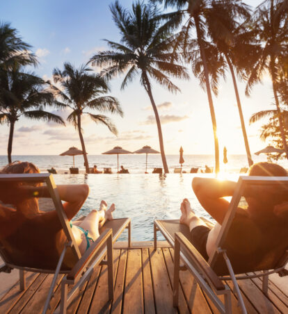
Imagine that you’ve become aware of a sale on batteries at a new superstore in town. You arrive in this superstore to purchase those batteries, but there’s no sign; nothing telling you where to go, nothing even acknowledging that batteries are even in the store. And then, slowly but surely, you begin to consider that maybe your former battery supplier isn’t so bad, why not just go back? Surely the price difference is worth the time you will save. This sense of unfamiliarity and confusion that is off-putting to the most interested of potential buyers isn’t limited to brick and mortar, it happens every day on websites too. Often times, when a business links users to their website homepage, they risk high bounce rates. Homepages aren’t enough, 96% of first-time site visitors aren’t ready to convert, they are interested in what you’ve offered them, but it takes some additional lifting to move them down the funnel.
This is where dedicated landing pages become exceedingly useful, they inform and persuade your site visitors to take specific desired actions. Staying true to the above analogy, consider how much easier it would be to walk in and have those batteries sitting at the register for you, correct price and all. This is what well-designed dedicated landing pages help accomplish. They simplify the process of conversion for the user by eliminating excess noise, therefore leading to higher conversion rates. Want proof? PPC Hero conducted a study on the use of designated landing pages by A/B testing a homepage versus a designated landing page. They experienced a 131% lift in conversion rate and a 4.46% lift in revenue. Now, these numbers can slide around depending on whether you are doing a lead generation or click through landing page and, of course, what industry you are in, but overall, the statistics lean towards overwhelming support for dedicated landing pages.
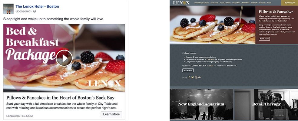
What is a landing page? A landing page is any webpage that your visitors arrive at after clicking on your advertisement, whether that’s social, display or even email. Landing pages can be anything, a homepage, a lead gen page or even a booking link. However, a dedicated landing page is specifically dedicated to whatever promotion or information brought the visitor to your site. For example, you are running a bed and breakfast package promotion, you have both social and display running for this promo. Visitors are interested and so they click through the ad, arriving at a specific page detailing the bed and breakfast package and including a “book now” link as the sole call to action. This user is moved down the funnel to conversion through the use of consistent messaging and imagery by way of a dedicated landing page. Below is a photo comparing the link between a social ad and a dedicated landing page:
This guide introduces you to fundamental benefits of designated landing pages and some best practices to increase the impact of your digital advertising.
1. User Reassurance
Consider our battery sale example used above. Imagine you had walked in and there was a visible, informational sign about the battery sale upon entry into the superstore. The sign corroborates the information you saw in the advertisement, leading you to feel more comfortable in your new environment. This is a very basic example of “message match”, a term that basically just means that your messaging is consistent across channels. If you’ve advertised a bed and breakfast package on social media, your landing page serves as a home for specific messaging about that bed and breakfast package. The messaging shares similar copy, keywords, and creative that makes a user feel more at ease with their new website experience. While social and display advertising serve as a snapshot of your offering, dedicated landing pages can serve as home base, providing supplemental or critical information to the package that may not have been included in your snapshot.
2. Visitor Attention Ratio
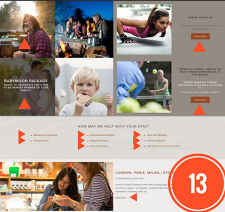
Aside from message match, dedicated landing pages serve as a way for businesses to manage what is known as the “visitor attention ratio.” Essentially, what this ratio is, is a comparison of how many interactive elements (ie. links) versus how many specific conversion goals (ie. book now button) are present on a webpage. A homepage typically exhibits a visitor attention ratio of 40:1. In simple terms, this means that for every specific conversion opportunity, there are 40 ways to leave the page (or be distracted from the conversion goal). Bottom line? Homepages are distracting. Take, for example, the below image of Topnotch Resort’s home page:
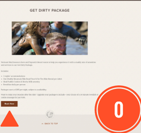
The homepage (excluding header/footer) exhibits 13 interactive elements versus 3 CTAs. There are so many opportunities for a visitor to become distracted from your initial messaging, leading them to different pages and lowering their probability of conversion. Alternatively, look at this landing page for their “Get Dirty” package:
This dedicated landing page simplifies everything for the user by providing ONE conversion CTA: “Book Now” and 0 interactive elements (excluding header/footer). Here, the user is provided more information about the package and then directly given the opportunity to book.
In the hotel industry, often times links are sent to booking engines, this is not a designated landing page. At GCommerce, we advise against this as it can cause a couple of problems: first, the message gets lost as soon as they click through, which can disorient the user; and second, for display advertising, you MUST link to a landing page. Booking engines are not considered “crawlable” by SEO spiders and, therefore, are not valid links. It’s a safer bet all around to just create a designated landing page that features a “Book Now” button that links users to the booking engine.
3. Best Practices
So now that we know why designated landing pages are fundamental to the success of your campaigns, how should they be built? Unbounce has supplied 5 steps to creating a successful landing page:
- Your Unique Selling Proposition
- Communicate what makes your offer unique immediately and clearly. You can do this through a headline, subheader, reinforcement statement, or closing argument. It’s estimated that you have 5 seconds to convince your user that you are worth their while and your USP is the quickest way to do this.
- The Hero Shot
- Use compelling imagery to convey a visual representation of your offer. Whether this is a photo or video, make sure it’s quality is up to par and that it is experiential. Supply imagery that helps your users imagine themselves at your property.
- Benefits
- If your users aren’t aware of what benefit the offer provides them, how well do you think it’s going to sell? Make this information clear and easy to find for the user. Use bullet points or numbers to show what’s included and why it is the right offer for them. Avoid paragraphs or thick walls of text that can make a user become disinterested in what you have to say.
- Social Proof
- In today’s marketing, especially in the hospitality industry, there are few things more powerful than social proof. Everything from what we buy to where we eat hinges on reviews. Studies have shown that there can be a 42% conversion increase just by including some form of social proof on your website. Landing pages are great for this as it further reassures the user that this purchase is right for them.
- A Single Conversion Goal – Call to Action
- Offer a single CTA above the fold. Using more than one CTA distorts the visitor attention ratio we discussed earlier. In hospitality, your CTA is typically going to be “Book Now.” Insert a colorful button that allows users to click through directly to your booking engine. Remember, your designated landing pages are valuable tools in persuading your users to take a single, desired action, so make that action clear through a single and effective CTA.
- Message Match
- Earlier, we discussed how important it is that a user feels reassured on your website through the use of message match, so naturally, it is essential that we include this as a best practice. Make sure that your information supplements your campaign but still matches the initial verbiage and keywords. You can tell visitors more details about your offer, whether it’s what’s included, applicable exclusions, how to book, or where to direct questions to, it’s always important to provide more information without losing your initial voice and tone.
- Naming Convention
- Have a care in how you name your landing pages. Often times, what you name your landing page is visible to the public. For instance, in the above Topnotch example, you wouldn’t want to name your landing page “Get Dirty Landing Page” because your link will look something like “topnotchresort.com/get-dirty-landing-page”. Which just looks ridiculous. Keep it simple and relevant, without referring to it as a landing page. For instance, a good landing page name is simply “Get Dirty”, which would display as “topnotchresort.com/get-dirty”. It’s short, it’s sweet, and it gets to the point.